Border CSS Style Examples: From Invisible Frames to Neon Dreams
Ever wondered how websites manage to wrangle those colorful boxes, those subtle dividing lines, those neon-drenched borders screaming for attention? You might have stumbled upon some cryptic code snippets mentioning "border" and "CSS" while spelunking through the web's underbelly. Well, friend, you've just bumped into the surprisingly fascinating world of CSS borders. Buckle up, because things are about to get pixel-perfect.
Before we dive into the depths of dashed lines and rounded corners, let's take a step back. Imagine CSS borders as the unsung heroes of web design. They're the framing that separates content, the subtle cues that guide your eye, the splash of personality that makes a website pop. From the minimalist chic of a single-pixel line to the in-your-face boldness of a gradient border, it's all possible with a few lines of code. But like any good design tool, there's a bit more to CSS borders than meets the eye.
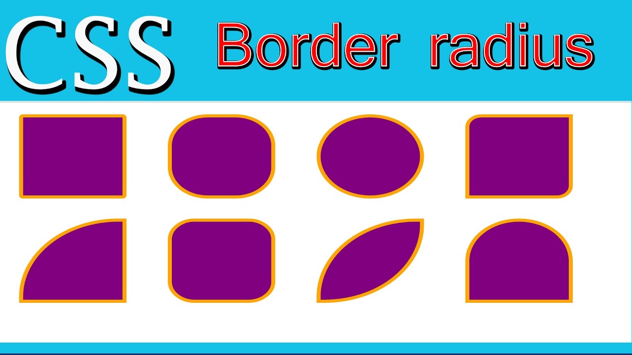
Back in the Wild West days of the early internet, borders were, well, basic. We're talking clunky tables and spacer GIFs just to achieve a semblance of structure. Then came CSS, riding in like a digital Clint Eastwood, and suddenly, we had control. We could specify thickness, style, color—a veritable buffet of border options. Over time, CSS evolved, gaining new tricks like rounded corners, dashed styles, and even the ability to create those trendy double borders that make everything look so sleek.
But why should you care? Well, mastering CSS borders isn't just about aesthetics, though that's certainly a big part of it. It's about understanding how to guide your user's attention, how to create visual hierarchy, and how to inject your own style into every pixel of your website. It's about taking those bland blocks of content and transforming them into something engaging, something that whispers (or shouts, depending on your border choices) "Look at me! I'm important!"
So, are you ready to trade those boring old default borders for something a bit more...you? Whether you're a seasoned developer or just starting out, there's always something new to discover in the ever-evolving world of CSS. And who knows? Maybe you'll be the one to push the boundaries of border design, creating the next big trend in digital aesthetics.
Now, let's get down to brass tacks and explore some of the nitty-gritty of CSS borders. First up, let's demystify some common properties:
border-style: This bad boy dictates what your border will actually look like. Want a solid line? Easy peasy. Feeling adventurous? Dive into the world of dashed, dotted, double, or even groove borders. The choice is yours!
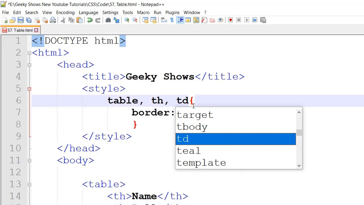
border-width: Thin and elegant or thick and bold? This property controls the width of your border, usually measured in pixels.
border-color: Now for the fun part—color! Go classic with black or white, unleash your inner rainbow, or get matchy-matchy with your brand colors.
But wait, there's more! You can even target specific sides of an element with border-top, border-right, border-bottom, and border-left. This opens up a whole new world of design possibilities, allowing you to create asymmetrical borders, underline specific elements, or even craft those trendy half-borders that are all the rage.
So, there you have it—a whirlwind tour through the fascinating world of CSS borders. Remember, the possibilities are limited only by your imagination (and maybe your coding skills, but hey, practice makes perfect!). Now go forth and borderize your world!
Unlocking the power of ulasan pbd in english your guide to effective reviews
Showcasing history creative newspaper display ideas
Timeless fathers day images exploring the power of black and white


