Choosing the Perfect Poster Font: A Guide to Eye-Catching Typography
Have you ever stopped to admire a poster and wondered what made it so captivating? While compelling imagery plays a significant role, the typography often holds the key to truly grabbing attention. The right poster font can transform a simple message into a powerful statement, making it memorable and impactful. Choosing the perfect font for your poster is crucial, but with so many options available, the process can feel overwhelming. This guide is designed to help you navigate the world of poster fonts and create designs that truly stand out.
Selecting an appropriate typeface for a poster is more than just picking something that looks "nice." It's about understanding the message you want to convey and finding a font that visually reinforces it. Whether you're designing a poster for a concert, a community event, a product promotion, or a personal project, the font you choose will speak volumes about your message and its intended audience. Think about the tone you want to set - serious, playful, elegant, or bold - and choose a font that reflects that.
The history of poster typography is deeply intertwined with the evolution of printing and graphic design. From the bold woodblock typefaces of early posters to the expressive and experimental fonts of the digital age, each era has brought its unique stylistic influences. Understanding this history can provide valuable context and inspiration as you choose the right font for your own poster creations. Consider the historical context of your poster's message – is a vintage-inspired font appropriate, or would a modern sans-serif typeface be a better fit?
Effective poster design relies heavily on impactful typography. A well-chosen font can make your poster instantly recognizable and memorable. It can also enhance readability, ensuring that your message is clearly communicated to your audience, even from a distance. However, poor font choices can lead to confusion, detract from the overall design, and ultimately render your poster ineffective. The legibility of your chosen typeface is paramount, especially at larger scales. A font that looks great on your screen might become illegible when enlarged to poster size.
One common issue encountered when designing posters is finding a balance between aesthetics and readability. While a decorative or stylized font might look visually appealing, it can be difficult to decipher, especially at larger sizes. Conversely, a simple, highly readable font might lack the visual impact necessary to grab attention. The key is to find a happy medium - a font that is both visually interesting and easy to read. Experiment with different font weights and styles to find the right balance for your poster.
Benefits of selecting a suitable typeface include improved readability, enhanced visual appeal, and effective communication of your message.
Choosing clear and legible fonts ensures your message is easily understood.
Visually appealing fonts grab attention and enhance the overall design of your poster.
Advantages and Disadvantages of Different Poster Font Styles
| Font Style | Advantages | Disadvantages |
|---|---|---|
| Serif | Classic, traditional, readable in large blocks of text | Can feel outdated or formal for some designs |
| Sans-serif | Modern, clean, versatile | Can lack personality or warmth |
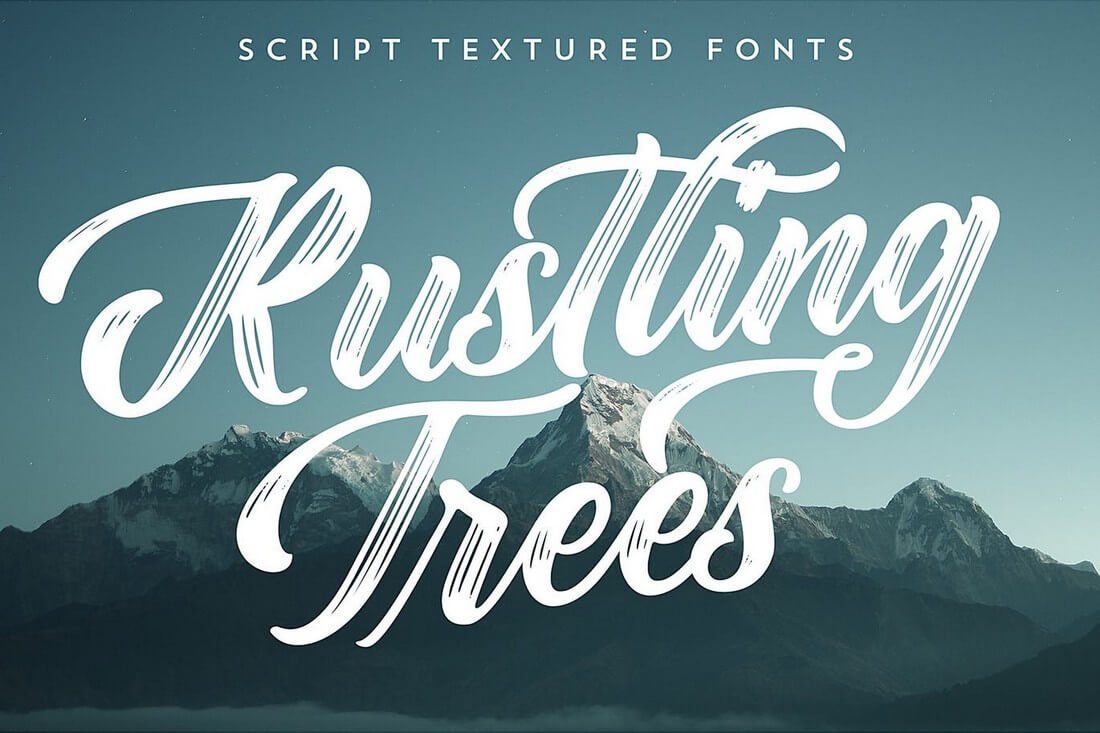
| Script | Elegant, decorative, ideal for special occasions | Can be difficult to read at smaller sizes or from a distance |
Best practices for implementing nice poster fonts include considering the viewing distance, using hierarchy effectively, and ensuring good contrast between text and background.
FAQ:
What are some popular poster fonts?
How do I choose the right font size for my poster?
Where can I find free poster fonts?
Can I mix different fonts on my poster?
How do I ensure my poster font is readable?
What are some common font pairing mistakes?
How do I make my poster text stand out?
What are some good online resources for poster design?
Tips and tricks for using poster fonts effectively include experimenting with kerning and tracking, using bold and italic variations strategically, and testing your design at different sizes.
In conclusion, choosing the right font for your poster is a critical step in creating a visually appealing and effective design. By considering the message, audience, and context of your poster, and by understanding the principles of typography, you can select fonts that enhance readability, grab attention, and effectively communicate your message. Remember to test your designs at different sizes and distances to ensure that your chosen font remains legible and impactful. The impact of a well-chosen font extends beyond mere aesthetics; it influences how your message is perceived and remembered. By taking the time to carefully consider your font choices, you can elevate your poster design and make a lasting impression on your audience. Don't be afraid to experiment with different styles and combinations to find the perfect font that brings your vision to life and makes your poster truly shine. Start exploring the world of poster fonts today and unlock the power of typography to create captivating and memorable designs.
Transform your desktop with enchanting dark forest wallpapers 1920x1080
Certificate border design frame your accomplishments in vibrant style
Sassy chic short shaggy hairstyles for thin hair over 60


