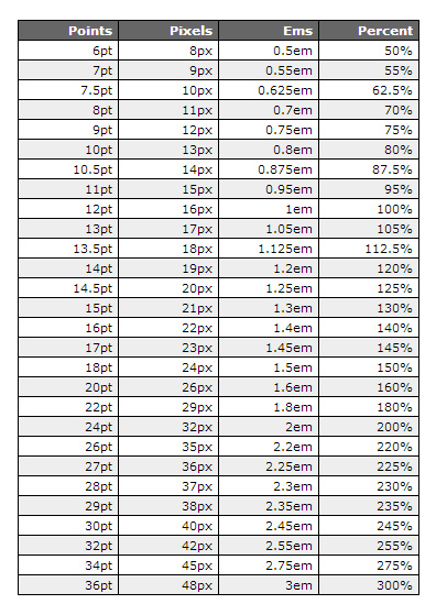
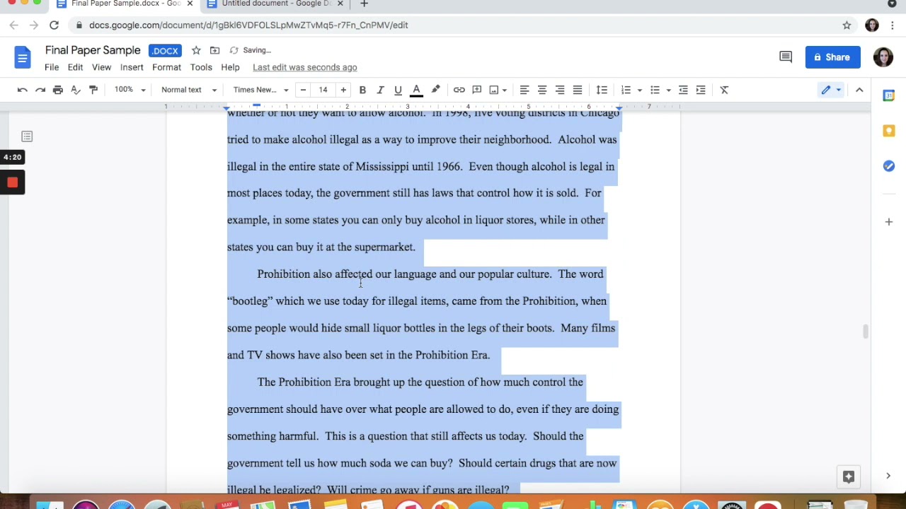
Deciphering the 12 Point Font: Why Size Matters in Digital Design
Ever wondered why 12 point font seems to be the goldilocks size for digital text? It's not just a random number. This seemingly insignificant detail plays a crucial role in how readers perceive and interact with content, impacting everything from readability to accessibility.
Choosing the right font size is more than just aesthetics; it directly influences user experience. Twelve-point font, often paired with standard fonts like Times New Roman, Arial, or Calibri, has become a conventional choice for a reason. But is it always the best option? Let's dive into the world of font sizing and explore the nuances of twelve-point fonts.
The history of 12 point font isn't precisely documented, but its prevalence likely stems from the days of print media and typewriters. These tools often defaulted to a similar size, and the convention carried over to the digital realm. Standard fonts, designed for clarity and readability, further solidified this pairing as a go-to for documents and web pages.
The importance of proper font sizing lies in its impact on readability. Too small, and the text becomes a strain on the eyes, leading to fatigue and frustration. Too large, and the content feels childish and unprofessional, disrupting the flow of reading. A twelve point font size generally strikes a balance, making text comfortable to read for most users.
However, the "ideal" font size can vary. Factors like screen resolution, viewing distance, and the user's visual acuity can all influence optimal readability. While 12pt font is a good starting point, it shouldn't be a rigid rule. Considering the context and your target audience is key.
One benefit of a 12-point font is its familiarity. Users are accustomed to seeing it, creating a sense of normalcy and ease. This familiarity contributes to a smoother reading experience.
Another advantage is its generally good readability on various devices. While adjustments might be needed for smaller screens, 12-point font generally displays well on desktops, laptops, and even tablets.
A third benefit is its professional appearance. Documents and web pages using 12-point font with standard typefaces project a sense of credibility and professionalism.
Advantages and Disadvantages of 12pt Font
| Advantages | Disadvantages |
|---|---|
| Readability on most devices | May be too small for some users |
| Familiar and comfortable for users | Can appear dense in large blocks of text |
| Projects a professional appearance | Not ideal for all design aesthetics |
Best Practices:
1. Consider your audience: Think about the demographics and potential visual impairments of your readers.
2. Test on different devices: Ensure your chosen font size displays well on various screens and resolutions.
3. Use standard fonts: Stick to familiar typefaces for optimal readability.
4. Adjust line height: Proper spacing between lines of text significantly improves readability.
5. Prioritize accessibility: Provide options for users to adjust font sizes according to their needs.
Frequently Asked Questions:
1. Is 12pt font always the best choice? No, it depends on context and user needs.
2. What are standard fonts? Common typefaces like Times New Roman, Arial, and Calibri.
3. How can I improve readability? Adjust font size, line height, and use clear fonts.
4. What is the impact of screen resolution on font size? Higher resolutions may require larger font sizes.
5. How can I make my website accessible for visually impaired users? Offer font size adjustment options.
6. Are there tools to help me choose the right font size? Yes, online readability checkers and accessibility guidelines can be helpful.
7. What about mobile devices? Test and optimize font sizes specifically for mobile viewing.
8. Can I use larger font sizes for headings? Yes, using larger sizes for headings creates visual hierarchy and improves readability.
Tips and Tricks:
Use browser zoom functionality to test readability at different sizes.
Consider using relative font sizes (em, rem) for better responsiveness.
In conclusion, while the 12-point font, combined with standard fonts, serves as a reliable baseline for digital content, understanding its role and considering various factors like user needs, context, and accessibility is crucial for creating a truly user-friendly experience. By prioritizing readability and adhering to best practices, designers and content creators can ensure their message is effectively communicated and easily consumed by a wider audience. The seemingly small detail of font size holds significant power in shaping the user experience and should be given careful consideration. Take the time to evaluate your audience, test your designs, and prioritize readability. Your users will thank you for it.
Navigating the ds 11 your first us passport
Exploring the world of brave new world raw manga
El pulpo junkyard los angeles


.png)


