Deciphering the Dance of Digital Script: Choosing the Ideal Font for Outlook
In the bustling digital agora of our inboxes, where missives fly back and forth like fleeting thoughts, the choice of typeface often goes unnoticed, a silent conductor of comprehension. Yet, this seemingly small detail holds the power to shape not only the readability of our messages, but also the very perception of our professionalism and intent.
What is the best font for Outlook email body text? This question, seemingly simple, unlocks a world of considerations. From the subtle serifs of Times New Roman to the clean lines of Arial, each font carries its own personality, its own whisper of meaning. Choosing the right one can transform an email from a jumbled collection of words into a clear, compelling narrative.
The history of typography is a rich tapestry, woven with threads of artistic expression and technological innovation. From the earliest carved inscriptions to the digital fonts we use today, the quest for legible and aesthetically pleasing letterforms has driven human creativity. The optimal font for email body text is not merely a matter of aesthetics, but also a functional imperative, ensuring clear communication across diverse platforms and devices.
The importance of selecting the correct font for Outlook emails lies in its impact on readability. A poorly chosen typeface can hinder comprehension, leading to misinterpretations and frustration. Conversely, a well-chosen font can enhance clarity, making the message more accessible and engaging. The key is to find a balance between aesthetics and functionality, a typeface that is both pleasing to the eye and easy to read.
One of the main issues surrounding email typography is the variability of email clients and devices. A font that appears perfectly rendered on one screen may appear distorted or substituted on another. This necessitates choosing web-safe fonts, typefaces that are widely supported across various platforms, ensuring consistent readability regardless of the recipient's email client or device.
Web-safe fonts are those commonly installed across most operating systems. Examples include Arial, Calibri, Times New Roman, Verdana, and Georgia. These fonts provide a high degree of assurance that your email will render as intended, regardless of the recipient's setup.
Benefits of selecting an appropriate font include enhanced readability, improved professional image, and increased engagement. A clear, easily readable font makes the email more accessible, reducing strain on the reader's eyes and facilitating comprehension. A professional-looking font conveys credibility and enhances the sender's image. And a visually appealing font can increase engagement, making the email more likely to be read and acted upon.
An effective action plan for choosing the right email font involves considering your audience, message, and brand identity. Select a font that aligns with your overall communication goals and resonates with your target audience.
Advantages and Disadvantages of Common Email Fonts
| Font | Advantages | Disadvantages |
|---|---|---|
| Arial | Widely supported, clean and modern | Can appear generic |
| Calibri | Modern and professional | May not be as widely supported as Arial |
| Times New Roman | Traditional and formal | Can appear outdated in some contexts |
| Verdana | Highly readable on screens | May appear less formal |
| Georgia | Elegant and readable | May not be as widely supported as Arial |
Best practices include using a consistent font throughout your email, avoiding decorative or overly stylized fonts, and selecting a font size that is easy to read. Also, consider the line spacing and paragraph breaks to further enhance readability.
Challenges in email typography often involve font rendering inconsistencies across different email clients. Solutions include sticking to web-safe fonts and testing your emails across different platforms to ensure consistent rendering.
Frequently Asked Questions:
1. What is the best font size for email? Generally, 12-14pt is recommended.
2. What is a web-safe font? A font commonly pre-installed across different operating systems.
3. Should I use serif or sans-serif fonts for email? Both are acceptable; choose one that suits your brand and message.
4. Can I use custom fonts in email? While possible, it's not recommended due to compatibility issues.
5. How can I test my email font rendering? Use email testing tools or send test emails to different email clients.
6. What are some examples of professional email fonts? Arial, Calibri, Verdana, Georgia, and Times New Roman.
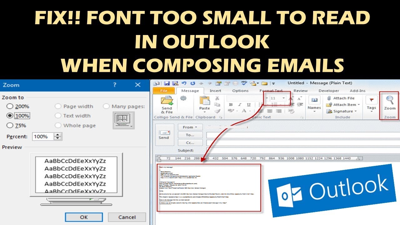
7. How can I change my default font in Outlook? Go to Outlook's settings and modify the font settings in the "Mail" section.
8. Why is my email font displaying differently on different devices? This is due to font rendering variations across email clients and operating systems. Using web-safe fonts minimizes this issue.
Tips and tricks for email typography include using bold and italics sparingly for emphasis, ensuring sufficient contrast between text and background colors, and using headings and subheadings to break up large blocks of text.
In the digital symphony of communication, the typeface serves as a subtle yet powerful instrument, shaping the melody of our messages. Choosing the right font for your Outlook email body is not merely a matter of aesthetics; it's an investment in clarity, professionalism, and effective communication. By understanding the nuances of typography and following the best practices outlined, you can ensure that your emails resonate with your audience, conveying your message with clarity and impact. The seemingly small decision of which font to employ can have a profound impact on how your message is received, fostering clarity, engagement, and ultimately, connection. Take the time to consider your options, experiment with different typefaces, and discover the font that best embodies your voice and message in the digital realm. By mastering the art of email typography, you can transform your inbox into a canvas of clear and compelling communication.
Elevate your independence day franklin tn style
Wakeboarding choosing the right boat for the perfect ride
Charleston sc a deeper experience


