Deciphering the Ideal Font Size for Your Word Documents
Crafting a professional and readable Word document hinges on many factors, and one often overlooked yet crucial aspect is selecting the appropriate font size. A poorly chosen size can make your document appear unprofessional, cluttered, or difficult to read, hindering effective communication. This article delves into the art of selecting the perfect font size for your Word documents, providing practical guidance, insightful examples, and helpful tips to ensure your message is conveyed clearly and effectively.
Choosing the right dimensions for your typeface can dramatically impact how your document is perceived. Too small, and your reader might strain their eyes, potentially missing key information. Too large, and the document can feel childish or overwhelming. Finding that Goldilocks size – just right – is essential for creating a document that is both visually appealing and easy to digest.
While there isn't a single universally perfect font size for all Word documents, understanding the factors that influence optimal sizing is key. These factors include the document's purpose, its intended audience, the chosen font, and the medium through which it will be consumed (printed or viewed digitally). This exploration will equip you with the knowledge to make informed decisions about font sizing, tailoring it to each specific document's needs.
The historical context of font sizing in printed materials goes back centuries, evolving alongside printing technology itself. Early printing presses often had limited font options and sizes, leading to standardized practices. With the advent of digital typography, the possibilities expanded dramatically, offering a wider range of font choices and sizes. However, this increased flexibility also brought new challenges, requiring careful consideration of readability and accessibility in the digital realm.
The importance of appropriate font sizing lies in its impact on readability and accessibility. A well-chosen font size contributes to a positive reading experience, allowing information to be absorbed effortlessly. Conversely, a poor choice can lead to frustration, eye strain, and ultimately, a failure to communicate effectively. Understanding the subtle nuances of font sizing empowers you to create documents that are not only visually appealing but also accessible to a wider audience.
A common issue related to font sizing is inconsistency. Varying font sizes within a single document can create a disorganized and unprofessional appearance. Maintaining consistency throughout your document, using appropriate sizes for headings, body text, and captions, is vital for creating a cohesive and polished presentation.
Generally, for body text in a Word document, a font size between 10 and 12 points is recommended. For headings, larger sizes are appropriate, typically ranging from 14 to 18 points depending on the heading level. These are just guidelines, and adjustments might be needed based on specific fonts and document purposes.
One simple example is a business report. Using 12-point Times New Roman for the body text and 16-point Calibri for headings creates a professional and readable document. However, a marketing brochure might benefit from more stylistic choices, potentially utilizing larger or more decorative fonts for headings and subheadings.
Benefits of Optimal Font Sizing:
1. Enhanced Readability: Choosing the right font size ensures your content is easy to read and digest, improving comprehension and engagement.
2. Professional Appearance: Consistent and appropriate font sizing contributes to a polished and professional look, enhancing credibility.
3. Improved Accessibility: Selecting suitable font sizes ensures your document is accessible to a wider audience, including those with visual impairments.
Best Practices:
1. Consider your audience: Think about who will be reading your document and adjust the font size accordingly.
2. Maintain consistency: Use the same font size for similar elements throughout your document.
3. Test different sizes: Experiment with different font sizes to find what works best for your specific document.
4. Prioritize readability: Ensure your chosen font size is easy on the eyes and doesn't require straining.
5. Consider the medium: Adjust font size based on whether the document will be printed or viewed digitally.
FAQ:
1. What is the standard font size for Word documents? Generally, 11 or 12 points.
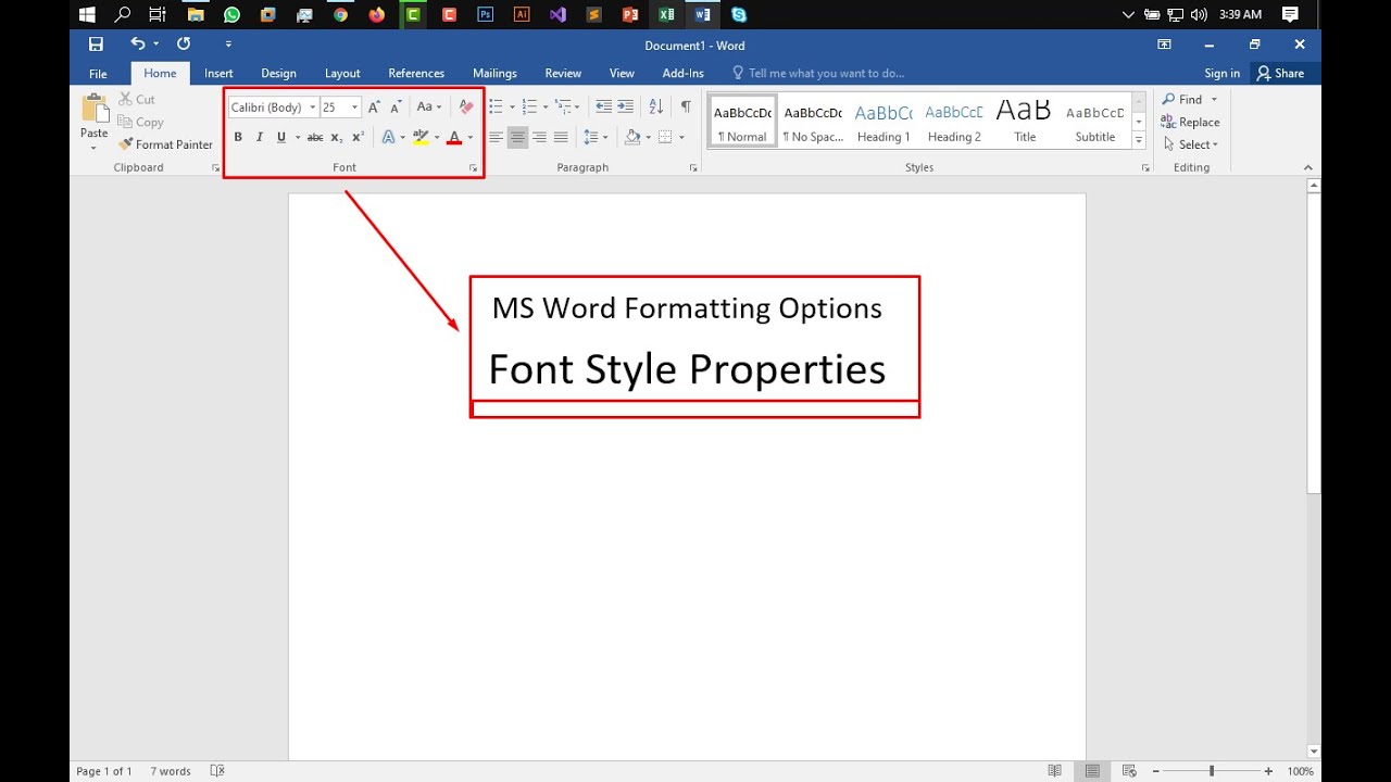
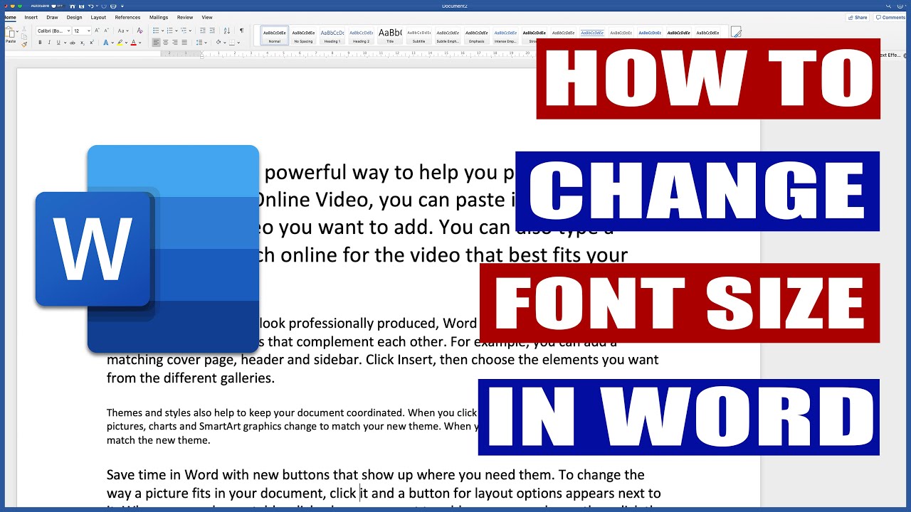
2. How do I change the font size in Word? Use the font size dropdown menu in the Home tab.
3. Should I use different font sizes for headings and body text? Yes, headings should be larger.
4. Does font choice affect optimal size? Yes, some fonts appear larger or smaller at the same point size.
5. What font size is best for printing? 12 point is often recommended.
6. What font size is best for online viewing? This can vary, but often 12-14 point works well.
7. How can I ensure my document is accessible? Choose a clear font and appropriate size.
8. What are some common font sizing mistakes to avoid? Inconsistent sizing, using extremely small or large fonts.
Conclusion: Selecting the appropriate font size for your Word documents is a crucial step in creating effective and professional communication. By considering your audience, maintaining consistency, and following best practices, you can ensure your documents are both visually appealing and easy to read. Mastering the art of font sizing enhances readability, accessibility, and the overall impact of your written work. Take the time to experiment, test, and refine your font choices to create documents that effectively communicate your message and leave a lasting positive impression on your readers. Don’t underestimate the power of this seemingly small detail – it can truly make or break your document's success.
Conquering the bracket the ultimate guide to expert picks
Unlocking the fun understanding bowling game prices
Transform your home with dulux exterior paint colours australia


