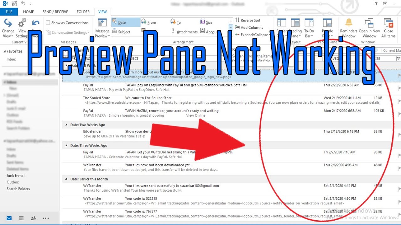
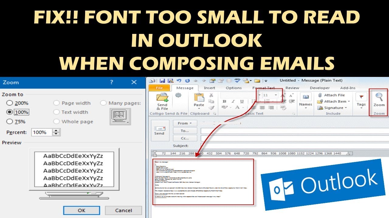
Deciphering the Outlook Preview Pane: Conquering Tiny Font Frustrations
Navigating the digital landscape of email can sometimes feel like traversing a dense forest of information. And within this forest, the Outlook preview pane, that window into our correspondence, can occasionally present a challenge: the seemingly diminutive font size. This can transform a quick scan into a squinting struggle, hindering our ability to efficiently process the daily influx of messages.
The preview pane, a core component of the Outlook experience, offers a glimpse into the content of emails without the need to open them individually. Its purpose is to streamline workflow, but a tiny, difficult-to-read font size can negate this advantage. This seemingly small detail can have a significant impact on productivity and overall user experience.
The default font size in the preview pane is often calibrated for a balance between displaying enough content and maintaining a compact view. However, individual preferences and visual needs vary considerably. What might be perfectly legible for one person might be a strain for another. This is where the ability to customize the preview pane's font size becomes crucial. Mastering this control allows users to tailor their email viewing experience for optimal comfort and efficiency.
The challenge of a small font size in the Outlook preview pane isn't new. It has been a recurring theme in discussions about email client usability. From online forums to technical support queries, the question of how to adjust this setting has been consistently raised, highlighting the importance of finding a solution that works for everyone. The difficulty often lies in the somewhat hidden nature of the controls and the variations across different Outlook versions.
Addressing this issue is not merely about aesthetics or personal preference; it directly impacts productivity and accessibility. A clear, easily readable font contributes to faster email processing, reduces eye strain, and makes the overall experience more enjoyable. This is particularly important for users who spend a significant portion of their day managing emails, and for those with visual impairments. Therefore, understanding how to customize the preview pane font size is an essential skill for any Outlook user.
Adjusting the zoom level within the preview pane offers a temporary fix. While viewing a specific email, use the Ctrl key and the + or - keys (or the scroll wheel on your mouse) to enlarge or reduce the text size. This, however, doesn't permanently change the default font size for future emails.
One benefit of a smaller font size is that more content can be displayed within the preview pane, allowing for quicker scanning of multiple emails. However, this advantage is quickly lost if the text becomes too small to read comfortably. For users with good eyesight and a preference for compact views, a smaller font size might be ideal.
Advantages and Disadvantages of a Smaller Preview Pane Font
| Advantages | Disadvantages |
|---|---|
| More content visible in the preview pane. | Increased eye strain. |
| Compact view, good for scanning multiple emails. | Reduced readability, especially for users with visual impairments. |
Frequently Asked Questions:
Q: How do I permanently change the font size in the Outlook preview pane? A: Unfortunately, there’s no direct setting. The zoom method affects the current message only.
Q: Does changing the display scaling in Windows affect the preview pane? A: Yes, increasing the display scaling will make everything larger, including the preview pane text.
Q: Are there any add-ins that can change the preview pane font size? A: Research available add-ins. Some might offer this functionality.
Q: Does the font size change affect the font size in the reading pane? A: No, these are separate settings.
Q: What about changing the system font size? Does that impact the preview pane? A: Generally not directly. It might influence some elements of the interface, but likely not the preview pane itself.
Q: Is there a difference between how this works in Outlook on the web versus the desktop application? A: Yes, the interfaces and settings are different.
Q: What if I change the font size for composing emails? Does that change the preview pane font? A: No, these are independent settings.
Q: What are some other ways to improve readability in Outlook? A: Adjusting the reading pane settings, changing the email background color, and using different reading views can help.
Tips and Tricks: Experiment with the reading pane's zoom functionality. Adjusting your screen resolution can also impact readability.
In conclusion, while directly changing the Outlook preview pane's font size can be challenging, understanding the available workarounds and strategies allows you to optimize your email viewing experience. From temporary zoom adjustments to exploring system-wide display settings, there are options to tailor the preview pane to your individual needs. Prioritizing readability not only improves productivity but also contributes to a more comfortable and enjoyable email management experience. Take the time to experiment with the available options and find the configuration that best suits your visual preferences and workflow. By conquering the tiny font frustrations, you can reclaim control over your inbox and navigate the digital forest with clarity and ease.
Imagenes de sol y luna beyond the celestial canvas
Willamette valley poker your guide to the oregon card scene
Unveiling the li ka shing centre a hub of innovation and knowledge


:max_bytes(150000):strip_icc()/2016_fonts-5c8c171cc9e77c0001eb1bf1.jpg)


