Deciphering the Report Font Code: Size and Style Secrets
Ever stared at a report and felt… uneasy? Maybe the font screamed amateur hour, or the tiny text strained your eyes. Choosing the right typography isn’t just about aesthetics, it’s about clarity, professionalism, and ensuring your message hits home. In the cutthroat world of business, reports are your ambassadors. A sloppy font choice can undermine even the most brilliant analysis.
So, what’s the magic formula for report typography? While there isn’t a one-size-fits-all answer, there are established conventions and best practices that can elevate your documents from mediocre to magnificent. This comprehensive guide will dive deep into the world of standard font sizes and styles for reports, covering everything from readability and accessibility to historical context and emerging trends.
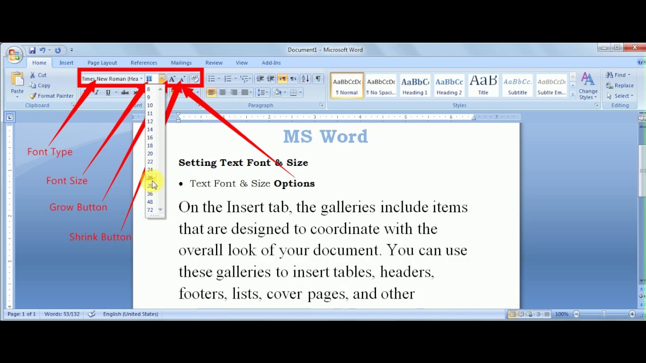
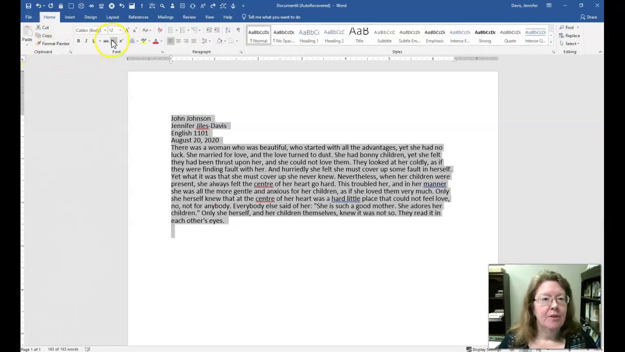
Historically, the preferred fonts for formal documents have been serif fonts like Times New Roman, often at 12-point size. This stems from the tradition of print media, where serifs were believed to aid readability in long blocks of text. However, the digital age has challenged this convention. With the rise of screens, sans-serif fonts like Calibri and Arial, also typically at 12-point size, have gained popularity due to their perceived clarity on digital displays. Choosing the correct font style and size is crucial for ensuring your report is both readable and professional.
The importance of proper font usage in reports cannot be overstated. It affects readability, accessibility, and the overall impression your document makes. A well-chosen font communicates professionalism and respect for the reader. Conversely, an inappropriate font can distract, confuse, and even undermine the credibility of your work. Think about it – a report in Comic Sans screams "unprofessional" faster than you can say "budget cuts."
Issues arise when non-standard or inappropriate fonts are used. Tiny fonts can make a report inaccessible to readers with visual impairments. Overly decorative fonts can distract from the content. Inconsistent font usage throughout a report creates a sense of disorganization. Navigating these potential pitfalls requires a clear understanding of best practices for font selection and usage.
One of the key benefits of adhering to standard font practices is enhanced readability. A clear, easily digestible font allows readers to focus on the content without straining their eyes. Another benefit is improved accessibility. Using appropriate font sizes and styles ensures that individuals with visual impairments can access and understand your report. Finally, employing standard fonts projects an image of professionalism, enhancing your credibility and the overall impact of your document.
Advantages and Disadvantages of Standard Fonts
| Advantages | Disadvantages |
|---|---|
| Improved readability | Can appear less creative in some contexts |
| Enhanced accessibility | May not reflect unique branding in some cases |
| Professional appearance | Can feel overused or generic in specific designs |
Best Practices for Implementing Standard Fonts:
1. Choose a legible font: Opt for clear, easy-to-read fonts like Calibri, Arial, or Times New Roman.
2. Use an appropriate font size: 12-point is generally considered standard for body text.
3. Maintain consistency: Use the same font and size throughout the report, except for headings and subheadings.
4. Consider your audience: Adjust font choices based on the reader's demographics and potential visual impairments.
5. Test your choices: Print a sample page to ensure the font is readable and visually appealing in its final format.
Real-world examples include academic papers, business reports, government documents, and legal briefs, which typically employ standard fonts like Times New Roman or Calibri at a 12-point size.
Frequently Asked Questions:
1. What is the standard font size for reports? Generally, 12-point.
2. What are some commonly used fonts for reports? Times New Roman, Calibri, Arial.
3. Why is font choice important in reports? It impacts readability, accessibility, and professionalism.
4. Should I use different fonts for headings and body text? Yes, but maintain a consistent overall style.
5. Can I use decorative fonts in reports? Generally, it's best to avoid them for formal documents.
6. How do I choose the right font for my report? Consider your audience, purpose, and desired level of formality.
7. Are there accessibility guidelines for font usage? Yes, WCAG (Web Content Accessibility Guidelines) provides recommendations.
8. What are some common mistakes to avoid? Using overly small or decorative fonts, inconsistent font usage.
Tips and tricks for using standard font sizes and styles for reports include using headings and subheadings to break up large blocks of text and improve readability, using bold or italic text sparingly for emphasis, and ensuring sufficient line spacing for comfortable reading.
In conclusion, choosing the right font and size is paramount for creating effective and professional reports. By adhering to established conventions and best practices, you can ensure that your reports are readable, accessible, and visually appealing. Remember, typography is more than just aesthetics; it’s a powerful tool that can enhance your credibility and ensure your message resonates with your audience. Don't let a poor font choice undermine your hard work – take the time to select typography that reflects the quality and professionalism of your content. Invest in the readability of your reports, and you'll be investing in their success. Start applying these best practices today, and see the difference a well-chosen font can make.
Fever in children a parents guide to understanding the causes
Craving a roast beef sandwich lowell ma has you covered
Banish white spots restore your wood tables beauty


