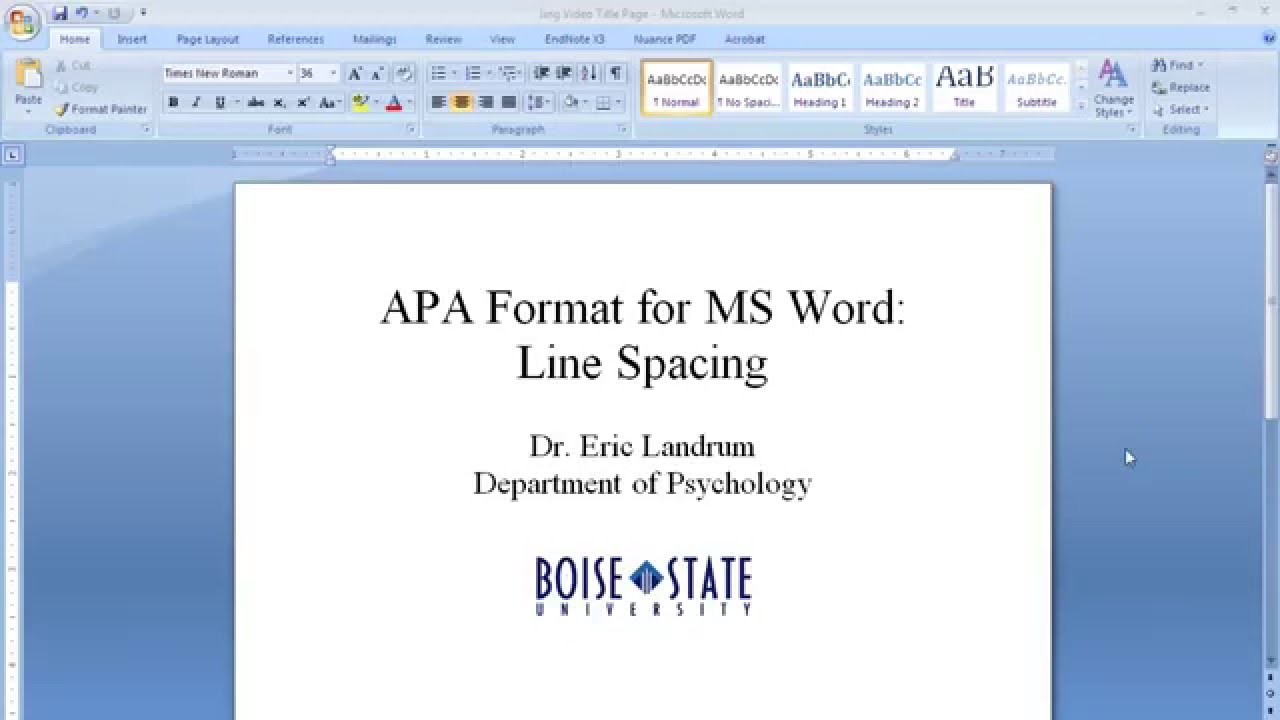
Decoding APA 7: Your Guide to Font and Spacing
Ever felt overwhelmed by the seemingly minute details of academic formatting? You’re not alone. Getting the typography just right can feel like navigating a minefield, but it's crucial for presenting your work professionally. This guide unravels the essentials of APA 7th edition font and line spacing, offering clarity and confidence for your next paper.
APA 7th edition emphasizes readability and consistency, which is why typography specifications are so important. These guidelines ensure your work is accessible to a wide audience and presents a polished, professional image. Imagine trying to read a densely packed document with inconsistent spacing and an unusual font – it would be a struggle. APA style aims to avoid this, promoting clear communication of your research.
The American Psychological Association (APA) style originated as a way to standardize scientific writing in the social sciences. Over several editions, it has evolved, reflecting changes in technology and publishing practices. The 7th edition emphasizes clarity and accessibility in the digital age. While previous editions allowed some font flexibility, APA 7 now strongly recommends specific fonts for optimal readability.
The importance of proper APA 7 formatting, specifically font and spacing, cannot be overstated. It not only ensures professionalism but also enhances readability and comprehension. By adhering to these guidelines, you demonstrate respect for academic conventions and ensure your work is taken seriously by your peers and professors.
So, what exactly are the rules for APA 7 font and line spacing? Simply put, APA 7 recommends using easily readable fonts like Times New Roman (12pt), Calibri (11pt), Arial (11pt), Georgia (11pt), or Lucida Sans Unicode (10pt). Double-spacing is required throughout the entire document, including the title page, abstract, body text, references, and appendices. This spacing allows for annotations and feedback and improves visual clarity.
One of the benefits of consistent APA 7 formatting is improved readability. Using a standard font size and double spacing makes the document less visually cluttered and easier on the eyes.
Another benefit is professionalism. Following these guidelines shows you’ve taken the time to present your work according to accepted academic standards, enhancing your credibility.
Finally, consistent formatting contributes to accessibility. Clear fonts and spacing make it easier for individuals with visual impairments or learning differences to engage with your research.
Advantages and Disadvantages of Strict Adherence to APA 7 Font and Spacing
| Advantages | Disadvantages |
|---|---|
| Enhanced Readability | Can sometimes feel restrictive |
| Professional Appearance | Requires careful attention to detail |
| Improved Accessibility |
Best Practices for Implementing APA 7 Font and Line Spacing:
1. Use the recommended fonts: Stick to Times New Roman, Calibri, Arial, Georgia, or Lucida Sans Unicode.
2. Maintain double-spacing: Ensure all parts of your document are double-spaced.
3. Utilize a hanging indent for references: Format your reference list with a hanging indent for each entry.
4. Use clear and concise language: Complement the visual clarity of APA formatting with clear and concise writing.
5. Proofread carefully: Double-check your formatting before submitting your work.
Frequently Asked Questions:
1. What is the recommended font size for APA 7? 12pt for Times New Roman, 11pt for Calibri, Arial, and Georgia, and 10pt for Lucida Sans Unicode.
2. Should I double-space my entire document? Yes, including the title page, abstract, body, references, and appendices.
3. Can I use a different font than the ones recommended? While not ideal, other readable fonts might be acceptable; check with your instructor.
4. What is a hanging indent? The first line of each reference entry is flush left, and subsequent lines are indented.
5. Why is double spacing important? It enhances readability and allows space for feedback and annotations.
6. How do I create a hanging indent? Most word processors have a specific function for creating hanging indents.
7. What if my instructor has different formatting requirements? Always follow your instructor's specific guidelines, even if they differ slightly from APA 7.
8. Are there online resources for APA formatting? Yes, numerous websites and apps offer APA style guides and templates.
Tips and Tricks for APA 7 Font and Spacing: Utilize the built-in formatting tools in your word processor. Most have pre-set styles for APA formatting, including hanging indents and double spacing. Using these tools can save you time and ensure consistency.
In conclusion, mastering APA 7 font and line spacing is essential for presenting your academic work effectively. While it might seem like a small detail, consistent formatting contributes significantly to readability, professionalism, and accessibility. By understanding the guidelines and utilizing available resources, you can confidently present your research in a clear and polished manner. Take advantage of the readily available tools and resources, including online style guides and templates, to streamline the formatting process and ensure your work meets the highest academic standards. This meticulous attention to detail will ultimately enhance the impact of your research and contribute to your success in academia.
The allure of a royal blue dress vestido azul rey para nina
Unlocking the joy of up on the housetop chords in c
Unveiling the allure dark red rose aesthetic wallpaper


