Decoding Font Styles: A Guide to Typography
Ever notice how different fonts evoke different feelings? A wedding invitation in a flowing script feels elegant, while a bold sans-serif on a tech website feels modern and clean. This magic lies in the art of typography and understanding different font styles, also known as typefaces. Choosing the right typeface is crucial for effective communication, whether you're designing a website, writing an email, or creating a presentation.
The world of typography is vast and varied. From classic serif fonts like Times New Roman to modern sans-serif fonts like Helvetica, each typeface carries its own personality and history. Understanding these distinctions can elevate your design and ensure your message is conveyed with the intended tone and clarity. This journey into the realm of font styles will equip you with the knowledge to choose the perfect typeface for any project.
Font styles, or typefaces, have a rich history dating back centuries. From the earliest handwritten scripts to the invention of the printing press and the digital revolution, typography has evolved alongside human communication. Early typefaces were often inspired by calligraphy, and their design reflected the tools and techniques used to create them. Over time, new styles emerged, influenced by artistic movements, technological advancements, and changing aesthetic preferences.
The importance of selecting the right typeface cannot be overstated. Font styles play a critical role in readability, brand identity, and overall aesthetic appeal. A poorly chosen font can make text difficult to read, clash with the overall design, or convey the wrong message. Conversely, a well-chosen font can enhance readability, reinforce brand identity, and create a visually appealing and engaging experience for the reader.
One of the main issues surrounding font styles is the sheer abundance of choices available. With thousands of typefaces to choose from, it can be overwhelming to select the right one. Furthermore, understanding the nuances of different font families, such as serif, sans-serif, script, and decorative, requires some knowledge of typographic principles. Navigating licensing restrictions and ensuring web compatibility can also present challenges.
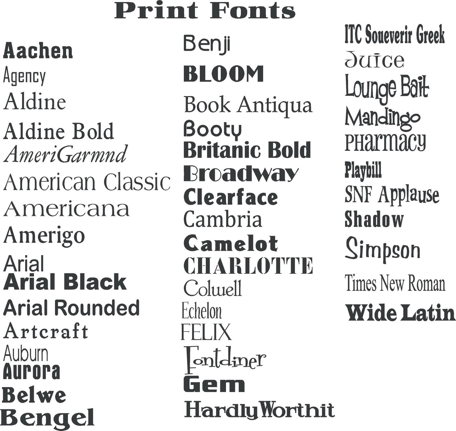
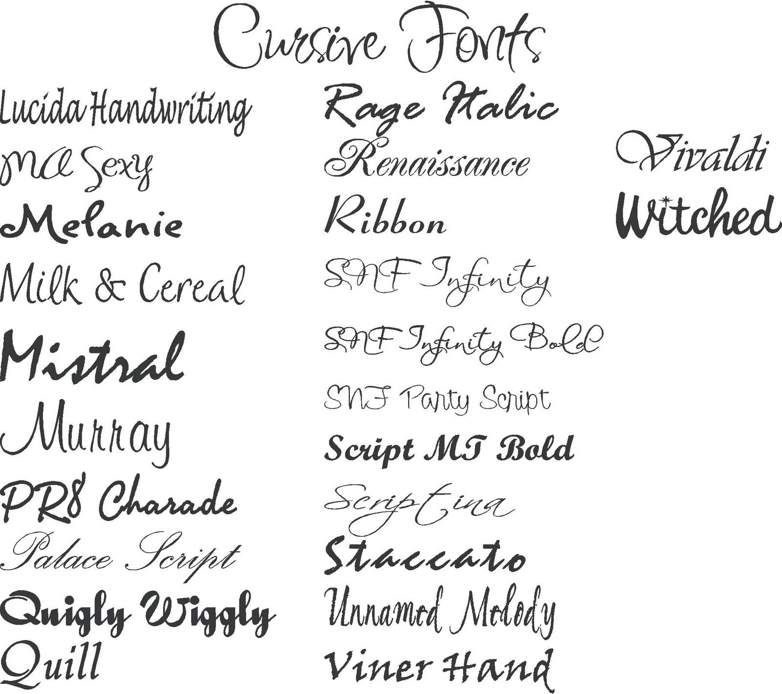
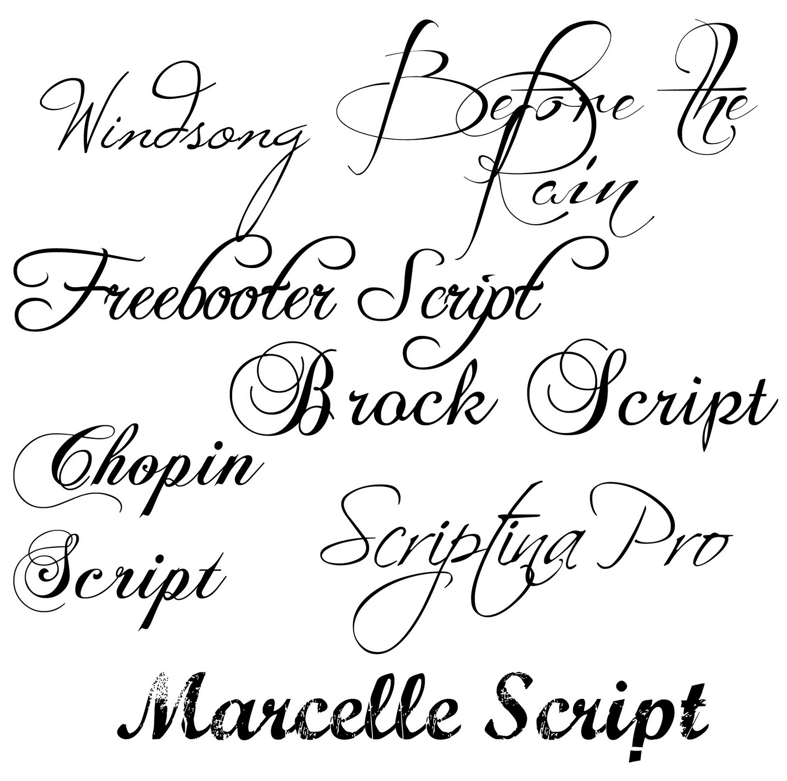
Serif fonts are characterized by small decorative strokes at the ends of letterforms. Examples include Times New Roman, Georgia, and Garamond. Sans-serif fonts, as the name suggests, lack these serifs. Popular examples include Arial, Helvetica, and Calibri. Script fonts mimic handwriting and are often used for formal invitations or elegant designs. Decorative fonts are more stylized and expressive, often used for headlines or display purposes.
Benefits of choosing appropriate fonts include improved readability, enhanced brand recognition, and a more polished and professional look. For example, using a clear and legible sans-serif font for body text on a website can improve readability. Using a distinctive font for a logo can contribute to brand recognition. A consistent and well-chosen font palette can give a design a professional and cohesive feel.
When choosing a font, consider your target audience, the purpose of your design, and the overall aesthetic you want to achieve. Start by selecting a few potential fonts and experiment with them in your design. Test different sizes and weights to see how they look in different contexts. Get feedback from others to ensure readability and visual appeal.
Advantages and Disadvantages of Different Font Styles
| Font Style | Advantages | Disadvantages |
|---|---|---|
| Serif | Readability in print, classic and traditional feel | Can appear dated or less legible on screens |
| Sans-serif | Clean and modern, good readability on screens | Can lack personality or feel too generic |
| Script | Elegant and formal, ideal for invitations | Can be difficult to read in large blocks of text |
Best practices: 1. Pair fonts carefully. 2. Prioritize readability. 3. Consider context. 4. Limit the number of fonts used. 5. Ensure web compatibility.
Real Examples: 1. The New York Times (serif). 2. Medium (sans-serif). 3. Wedding invitations (script). 4. Movie posters (decorative). 5. Tech company logos (sans-serif).
Challenges and Solutions: 1. Font licensing - choose open-source or commercially licensed fonts. 2. Web compatibility - use web-safe fonts or web font services. 3. Readability issues - test different font sizes and weights. 4. Overuse of decorative fonts - use sparingly for emphasis. 5. Inconsistent font usage - create a style guide.
FAQ: 1. What is a font style? 2. What is the difference between serif and sans-serif? 3. How do I choose the right font? 4. What are web-safe fonts? 5. What are font families? 6. How many fonts should I use in a design? 7. Where can I find free fonts? 8. What is kerning?
Tips: Use font pairings for visual interest. Experiment with different font weights. Consider the mood and tone of your design. Use kerning and tracking to adjust spacing.
In conclusion, understanding the nuances of different font styles is essential for effective communication and design. By carefully considering factors like readability, brand identity, and overall aesthetic, you can choose the perfect typeface to convey your message with clarity and style. From the classic elegance of serif fonts to the clean modernity of sans-serif, the diverse world of typography offers a wealth of options to enhance your designs. Explore, experiment, and discover the power of font styles to elevate your creative projects. Take the time to research different typefaces and practice implementing them in your work. By mastering the art of typography, you can unlock a new level of visual communication and bring your designs to life. Remember, the right font can make all the difference in how your message is perceived.
The eileen enigma unraveling the mystery behind dexys midnight runners hit
The subtle nuances of sw 7030 anew gray
Decoding the warren county ny jail roster a deep dive


