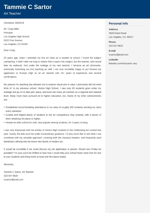
Decoding the Cover Letter Font Code: Size, Style, and Success
Imagine this: you’ve poured your heart and soul into crafting the perfect cover letter. You’ve meticulously tailored it to the specific job description, highlighting your skills and experience with laser precision. But there’s one crucial detail that could make or break your chances: the font and size you choose.
Yes, it might seem like a small thing, but the typography of your cover letter plays a surprisingly significant role in how it's perceived. A poorly chosen font can make your letter look unprofessional, cluttered, or even difficult to read, instantly landing it in the reject pile. Conversely, the right font and size can enhance readability, convey professionalism, and make your letter stand out from the crowd.
So, what's the secret code to cracking the cover letter font conundrum? Let's dive into the world of typography and explore the best practices for choosing the perfect font and size for your cover letter.
Choosing the right typography for your cover letter isn't about following arbitrary rules; it's about creating a positive first impression. Your cover letter is often the first interaction a potential employer has with you, and its appearance speaks volumes about your attention to detail and professionalism.
Think of your cover letter as your professional handshake. A firm, confident handshake leaves a positive impression, while a limp or overly aggressive one can be off-putting. Similarly, a well-formatted cover letter demonstrates your professionalism and respect for the reader's time.
Historically, cover letters were primarily typed on typewriters, limiting font choices. With the advent of computers, a plethora of fonts became available, making the selection process more complex. The importance of appropriate font selection stems from the need to create a professional and readable document. One of the main issues today is the overuse of decorative or unprofessional fonts, which can detract from the content of the letter.
Generally, serif fonts (like Times New Roman) and sans-serif fonts (like Arial or Calibri) are considered appropriate for cover letters. Serif fonts have small decorative strokes at the ends of letters, while sans-serif fonts lack these strokes. A recommended font size is between 10 and 12 points.
Benefits of choosing the correct font and size include improved readability, enhanced professionalism, and increased chances of getting your application noticed. For example, using a clear, easy-to-read font like Calibri in size 11 ensures that the hiring manager can easily digest your qualifications. Using a professional font like Times New Roman or Georgia projects an image of competence and attention to detail.
Action Plan:
1. Choose a professional font (Times New Roman, Arial, Calibri, Georgia).
2. Set the font size to 10-12 points.
3. Ensure consistent formatting throughout the document.
FAQ:
1. What is the best font for a cover letter? Generally, Times New Roman, Arial, Calibri, and Georgia are good choices.
2. What size should my cover letter font be? Stick to 10-12 points.
3. Can I use a decorative font? It's best to avoid decorative fonts for professional documents.
4. Should I use the same font for my resume and cover letter? Yes, maintaining consistency is recommended.
5. Is it okay to use bold or italics? Use them sparingly to emphasize key points.
6. What about line spacing? Single or 1.15 spacing is generally recommended.
7. Should I justify the text? Left-aligning your text is generally preferred for readability.
8. How can I ensure my cover letter is easy to read? Choose a clear font, appropriate size, and consistent formatting.
Tips and tricks: Test your chosen font by printing your cover letter to ensure readability.
In conclusion, selecting the correct font and size for your cover letter is a crucial step in making a positive first impression. While it might seem like a minor detail, the typography you choose significantly impacts how your letter is perceived. By opting for a professional font like Times New Roman, Arial, Calibri, or Georgia, and setting the size between 10 and 12 points, you ensure readability and project an image of professionalism. This simple yet effective step can significantly enhance your chances of getting your application noticed and landing that coveted interview. Take the time to carefully consider your font choices and ensure your cover letter is visually appealing and easy to read. It's a small investment of time that can yield substantial returns in your job search journey. So, make sure your cover letter's appearance reflects the quality of your skills and experience, and let your words shine through with clarity and impact.
Unveiling the jackson church furnace a comprehensive guide
Unlocking your ultimate team navigating the fc24 companion app
Unraveling the enigma what are aries men like como son los aries hombre


