Decoding the World of Fonts: A Guide to Font Families and Their Unique Styles
Have you ever noticed how a simple change in lettering can completely transform the feel of a design? The world of fonts is a vast and captivating one, with each typeface possessing its own unique personality and power to communicate. This exploration into the realm of font families will equip you with the knowledge to navigate this world and harness the power of different font styles.
Font families, also known as typefaces, are collections of fonts that share similar design characteristics. These characteristics can include the thickness of the strokes, the presence or absence of serifs (small decorative strokes at the ends of letterforms), and the overall shape and style of the letters. Understanding these distinctions allows you to select the perfect font to convey the intended message and aesthetic of your design.
The history of fonts stretches back centuries, beginning with the development of handwritten scripts and evolving with the invention of the printing press. From the elegant strokes of calligraphy to the clean lines of modern sans-serif fonts, the evolution of typefaces reflects the changing cultural and technological landscape. Early fonts, like Garamond and Baskerville, were designed for readability in printed books. Later, the advent of digital technology ushered in a new era of font design, with typefaces like Helvetica and Arial becoming ubiquitous in the digital world.
The importance of selecting appropriate fonts cannot be overstated. Fonts play a crucial role in establishing visual hierarchy, enhancing readability, and conveying the desired tone and mood. A well-chosen font can make a design feel professional, playful, elegant, or modern, while a poorly chosen font can detract from the overall message and impact. Think about the logo of your favorite brand – the font likely contributes significantly to the brand's identity.
One of the main issues related to fonts is licensing. Some fonts are free to use, while others require a paid license, particularly for commercial use. It's essential to understand the licensing agreements before using a font in your projects to avoid legal issues. Another challenge is ensuring that the chosen font displays correctly across different devices and browsers. Web-safe fonts are designed to be compatible with most systems, providing a consistent viewing experience for all users.
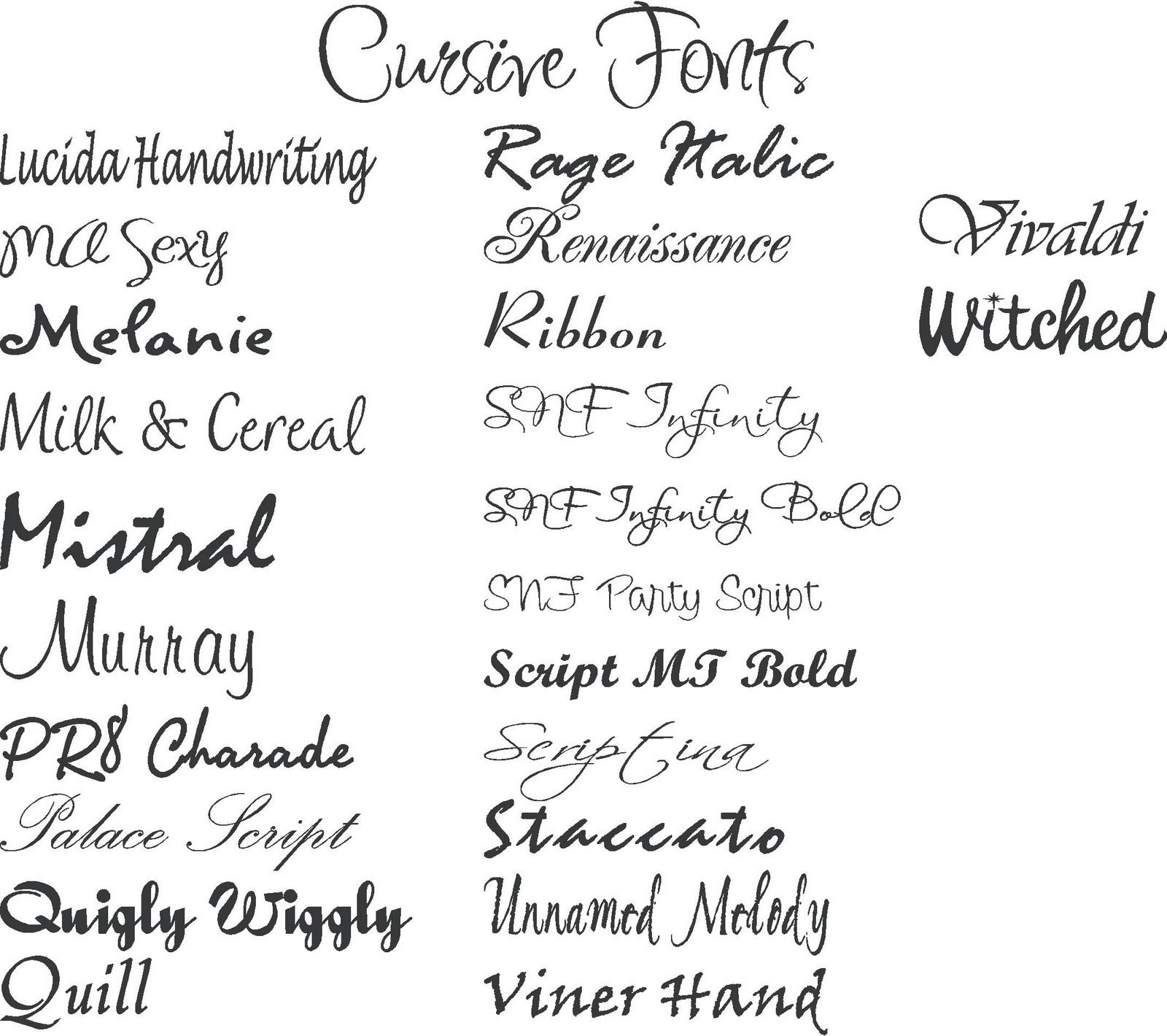
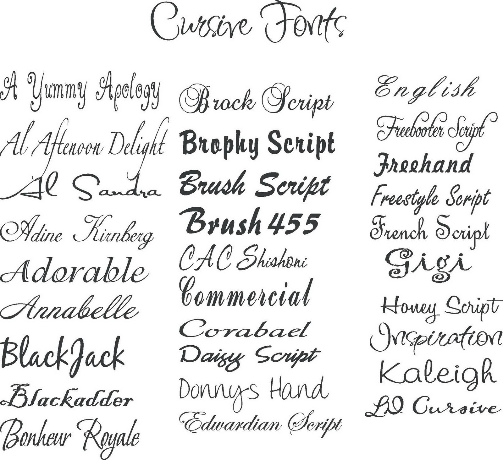
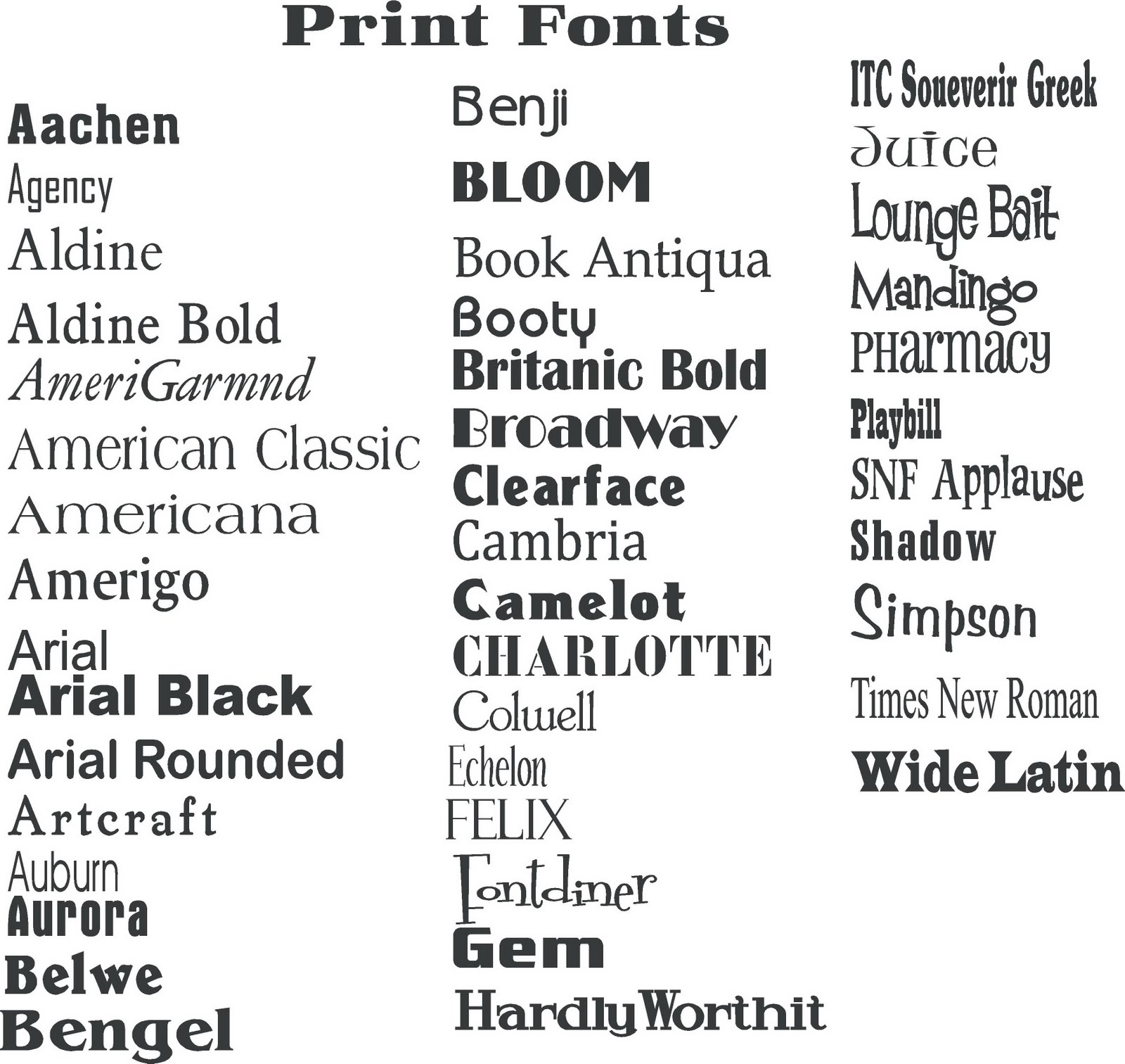
Serif fonts, like Times New Roman and Georgia, are characterized by their small decorative strokes. These serifs enhance readability in long blocks of text, making them a popular choice for body copy in books and newspapers. Sans-serif fonts, like Arial and Helvetica, lack these serifs and offer a clean, modern look. Script fonts mimic handwriting and are often used for invitations or headings, while display fonts are decorative and designed for large sizes, often used in logos and posters.
Benefits of choosing the right font:
1. Enhanced Readability: Selecting a legible font makes content easy to consume, improving user experience. Example: Using a serif font like Garamond for a novel.
2. Brand Consistency: Consistent use of specific font families helps establish a strong brand identity. Example: Apple's consistent use of San Francisco across its products.
3. Improved Aesthetics: A well-chosen font can elevate the overall visual appeal of a design. Example: Using a script font for wedding invitations.
Advantages and Disadvantages of Different Font Types
| Font Type | Advantages | Disadvantages |
|---|---|---|
| Serif | Readability in print, classic feel | Can appear dated in some digital contexts |
| Sans-serif | Modern, clean, good for web | Can lack personality in some cases |
| Script | Elegant, decorative | Can be difficult to read in small sizes |
Best Practices:
1. Limit the number of font families used in a single design.
2. Pair fonts carefully to create visual harmony.
3. Consider the context and audience when selecting fonts.
4. Ensure web fonts are optimized for performance.
5. Test fonts across different devices and browsers.
Examples: Helvetica (Swiss International Style), Times New Roman (newspapers), Garamond (classic books), Futura (modern and geometric), Comic Sans (informal).
FAQ:
1. What is a font family? (Group of related fonts)
2. What is the difference between serif and sans-serif? (Serifs)
3. How do I choose the right font? (Consider context)
4. What are web-safe fonts? (Cross-platform compatibility)
5. Where can I find free fonts? (Google Fonts, etc.)
6. What is font licensing? (Permission for usage)
7. How do I install fonts on my computer? (System settings)
8. What is kerning? (Spacing between letters)
Tips: Use font pairing tools, explore font libraries, experiment with different styles.
In conclusion, the world of fonts is a rich and dynamic landscape, offering a vast array of choices for designers and communicators. From the classic elegance of serif fonts to the clean modernity of sans-serif, each typeface possesses its own unique personality and power to convey meaning. By understanding the history, characteristics, and best practices of font selection, you can harness the power of typography to create visually appealing and effective designs. Choosing the right fonts can enhance readability, establish brand identity, and elevate the overall aesthetic of your work. As you embark on your design journey, remember to explore the vast world of font families, experiment with different styles, and always consider the context and audience to ensure your message is communicated clearly and effectively. Take the time to carefully select fonts that align with your project's goals, and you'll unlock the true potential of typography to create impactful and engaging designs. Embrace the diversity of fonts and let your creativity flourish!
Unlocking tiktok navigating the platform without an account
Unraveling the mystery michael aftons true identity
Finding your perfect healthcare match a guide to primary care doctors in hillsboro oregon


