Font Families: The Secret Sauce of Typography (And Why You Should Care)
Ever wonder why some websites look sleek and professional while others feel like a ransom note assembled from magazine clippings? It's all about the fonts, baby. More specifically, it's about understanding and utilizing font families effectively. This isn't just about making things "look pretty," though that's a definite perk. Choosing the right font family can significantly impact readability, brand perception, and overall user experience.
So, what are font families, anyway? They're basically groups of typefaces that share common design features. Think of it like a family reunion: Arial, Arial Bold, Arial Narrow—they're all related, sharing similar characteristics, but with individual quirks. Understanding these relationships is key to creating visually appealing and consistent designs. Ignoring font families can lead to a chaotic mess, like that time your aunt wore a leopard print jumpsuit to your cousin's wedding. It's just… not a good look.
The history of font families goes way back. From the earliest carved typefaces to the digital fonts we use today, the evolution of typography is a fascinating journey. The development of printing technology played a crucial role in establishing the concept of font families, allowing for variations within a typeface, such as bold, italic, and different sizes. These developments solidified the importance of consistent typefaces in printed materials.
Choosing the correct font family is crucial for branding and readability. Imagine using Comic Sans for a law firm's website – yikes! The wrong font can undermine your message and make your brand look unprofessional. Conversely, the right font can evoke specific emotions, establish trust, and enhance the overall aesthetic appeal of your content. It's about finding the perfect voice for your message.
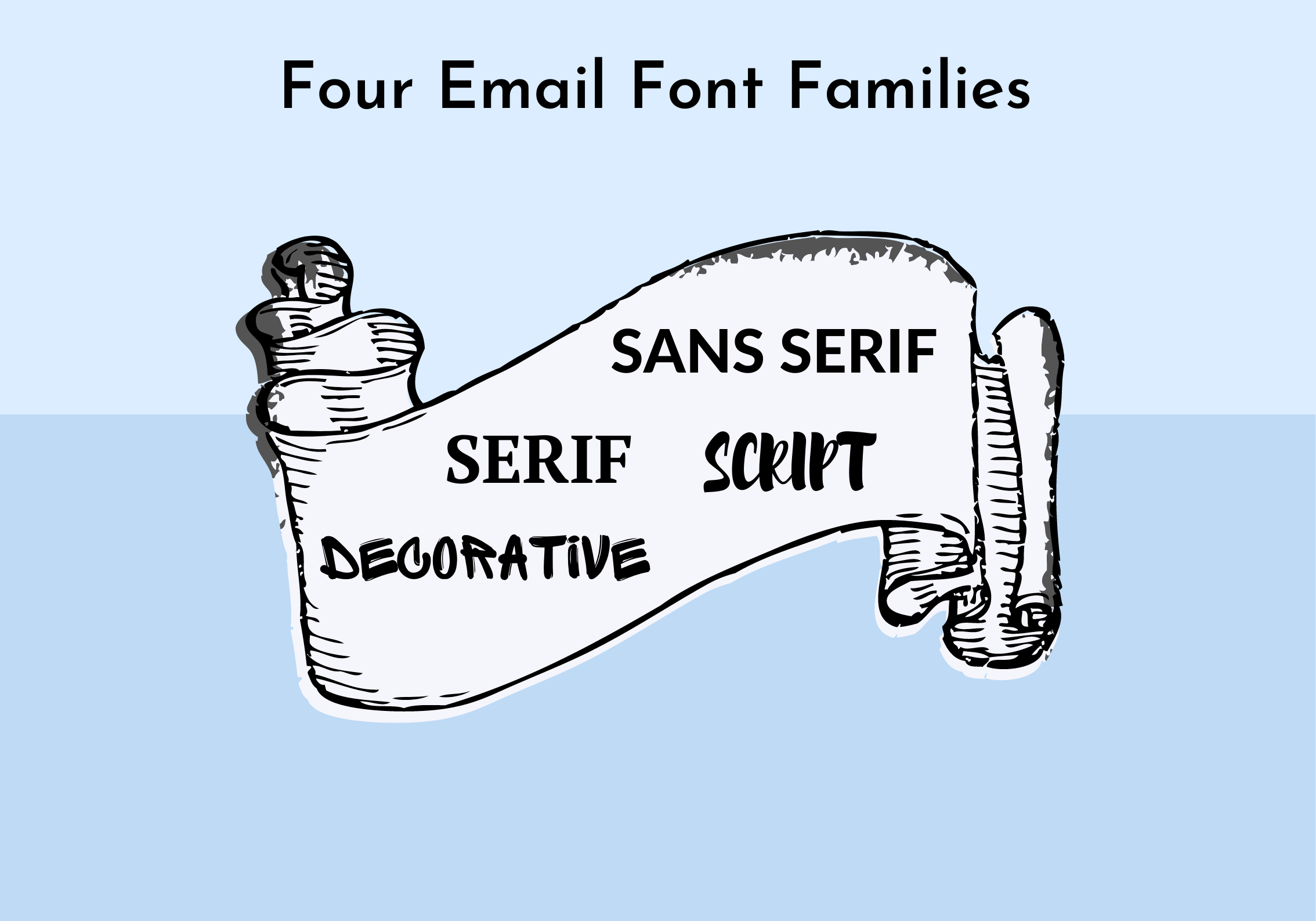
Different classifications of fonts exist, each with distinct characteristics. Serif fonts, with their little feet (serifs) at the ends of strokes, evoke a sense of tradition and formality. Sans-serif fonts, lacking those serifs, offer a cleaner, more modern look. Choosing between serif and sans-serif, or even venturing into the world of script or decorative fonts, depends entirely on the project's tone and purpose.
One major issue with font families is licensing. Using a commercial font without proper licensing can land you in hot water. Always check the licensing agreement before using a font, especially in commercial projects. Open-source fonts can be a great alternative, offering a wide range of styles without the licensing headaches.
A simple example of a font family is the Helvetica family. It includes variations like Helvetica Light, Helvetica Bold, and Helvetica Oblique. Each variation retains the core Helvetica characteristics but offers different weights and styles.
Benefits of using font families consistently include improved readability, enhanced brand identity, and better visual hierarchy. Readability improves because consistent fonts make text easier to scan and digest. Brand identity is strengthened by associating a specific font with your brand, making it instantly recognizable. Visual hierarchy is achieved by using different font weights and styles within a family to emphasize important information.
Advantages and Disadvantages of Using Web Fonts
| Advantages | Disadvantages |
|---|---|
| Enhanced Visual Appeal | Potential Performance Issues |
| Branding Consistency | Licensing Costs |
| Improved Readability | Limited Browser Support (for some fonts) |
Best Practices for implementing font families:
1. Limit the number of font families used in a single project.
2. Pair fonts carefully, ensuring they complement each other.
3. Consider the context and purpose of the project when selecting fonts.
4. Optimize web fonts for performance to avoid slow loading times.
5. Ensure accessibility by choosing fonts that are easy to read for everyone.Real-world examples of font families: Times New Roman (serif, traditional), Arial (sans-serif, versatile), Helvetica (sans-serif, modern), Georgia (serif, elegant), and Comic Sans (sans-serif, informal - use with caution!).
Challenges and solutions: licensing issues (use open-source fonts), performance issues (optimize web fonts), cross-platform compatibility (test on different devices), font availability (choose widely supported fonts), and accessibility (select legible fonts).
FAQs:
1. What's the difference between a typeface and a font? (A typeface is the design, a font is the specific implementation.)
2. Where can I find free fonts? (Google Fonts, Font Squirrel.)
3. How do I install fonts on my computer? (System-specific instructions apply.)
4. How many fonts should I use on a website? (Generally, no more than three.)
5. Can I use any font for commercial projects? (Check the licensing agreement.)
6. How do I choose the right font for my brand? (Consider your target audience and brand personality.)
7. What are web-safe fonts? (Fonts pre-installed on most operating systems.)
8. How can I improve web font performance? (Optimize for file size and use caching.)Tips and tricks: Experiment with font pairings, use font weights and styles effectively, prioritize readability, and always test your designs on different devices.
In conclusion, understanding and implementing font families is crucial for anyone working with text, whether it's designing a website, creating a presentation, or writing a document. Font families aren't just about aesthetics; they directly impact readability, brand perception, and overall user experience. From the historical significance of typography to the practical considerations of licensing and performance, mastering font families is essential for effective communication. By following the best practices outlined above and continually exploring the vast world of typography, you can elevate your designs, enhance your brand, and ensure your message is delivered with clarity and style. So, take the time to choose your fonts wisely—your audience (and your brand) will thank you.
Semakan skim insurans am selangor your guide to understanding insurance in selangor
Pastel para un hombre a deep dive into men and pastels
Embracing the unexpected a journey to new caledonia


