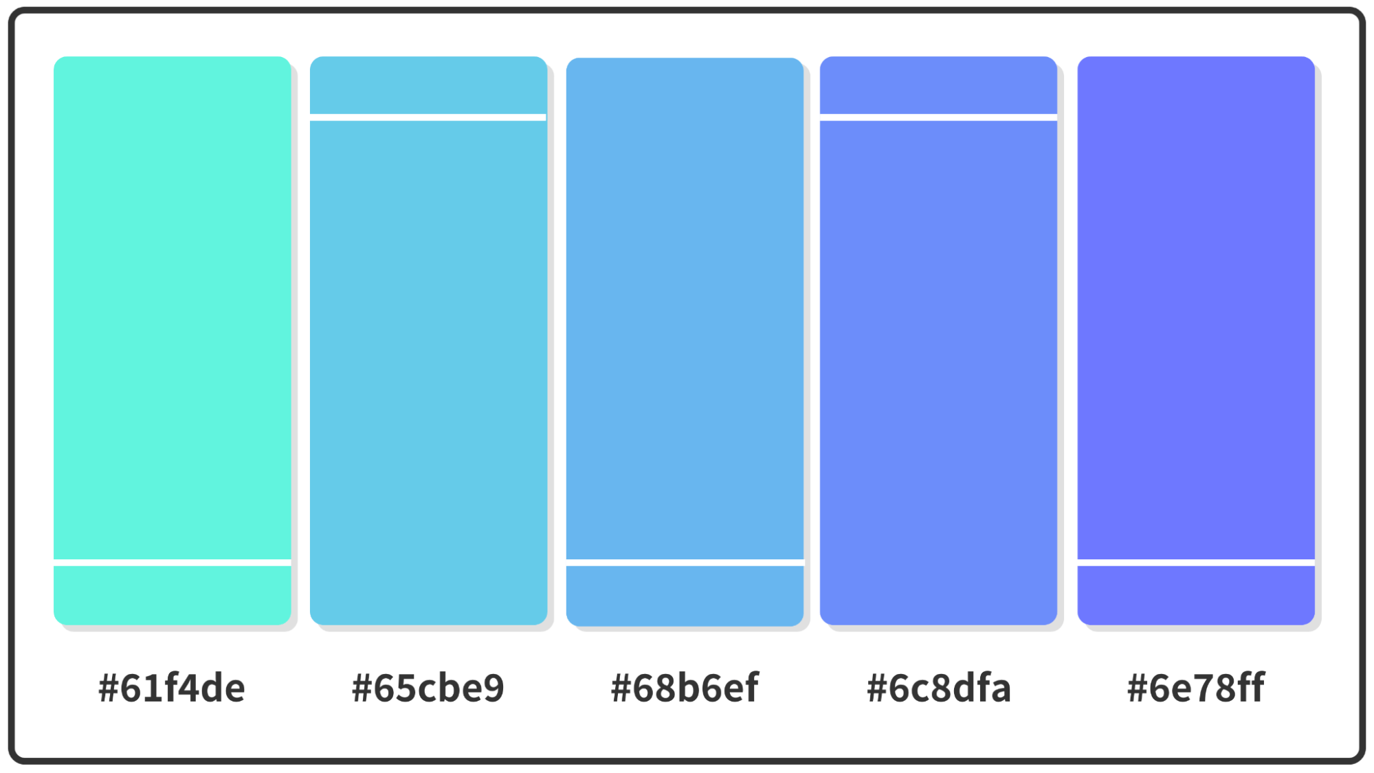
Pastel Blue Color Palette Hex Codes: Your New Design BFFs?
Is it just me, or does the world feel a little extra right when you stumble upon the perfect shade of pastel blue? It's like that sigh of relief after a long day, but in color form. And let's be real, sometimes you just need that sense of calm, especially when you're knee-deep in a design project, trying to make every pixel sing.
So, we're talking pastel blue color palettes today - those soft, dreamy shades that whisper rather than shout. They're the color equivalent of that perfectly worn-in denim jacket, effortlessly cool and always in style. Whether you're a seasoned designer or a total newbie dipping your toes into the wonderful world of color palettes, there's something about pastel blues that just feels approachable, even inspiring.
But here's the catch – pastel blue isn't just one shade, it's a whole spectrum of whisper-thin hues, each with its own personality. There's baby blue, with its innocent and sweet vibe, perfect for a nursery or a brand that wants to evoke feelings of purity. Then there's the slightly more grown-up sky blue, reminiscent of a clear summer day, ideal for travel blogs or anything that screams "escape." And let's not forget about the more muted, almost-greyish blues, like powder blue, that bring a touch of sophistication and tranquility to minimalist designs.
And then, of course, there are the hexadecimal codes – those seemingly cryptic combinations of letters and numbers that actually hold the key to unlocking the precise shade of pastel blue you're dreaming of. Think of them as the secret language of designers, a way to communicate color with absolute accuracy. Knowing your #ADD8E6 from your #B0E0E6 can make the difference between a design that falls flat and one that truly sings.
So, whether you're revamping your website, creating a mood board for your next big project, or just want to understand why certain shades of blue make you feel all warm and fuzzy inside, buckle up. We're diving deep into the world of pastel blue color palette hex codes, uncovering their secrets, and figuring out how to use them to create designs that are not just aesthetically pleasing but also emotionally resonant.
Now, let's talk about some of the most popular pastel blue hex codes, shall we? We've got your classics like #B0E0E6 (Powder Blue), #ADD8E6 (Light Blue), and #87CEEB (Sky Blue). These are your workhorses, your go-tos for creating a sense of calm and serenity. But don't be afraid to branch out and explore the less-traveled paths of the pastel blue spectrum.
Try incorporating shades like #A2CFE4 (Pale Aqua), with its hint of green, for a more refreshing feel, or #C6E2EE (Pale Turquoise), which leans slightly towards purple, for a touch of whimsy. And if you're feeling really adventurous, dip your toes into the world of desaturated blues like #BDC3C7 (Silver Blue), which adds a dose of understated elegance to any design.
Remember, the key to mastering pastel blue color palettes is to experiment, play around, and find what resonates with you and your brand. After all, design is all about expressing yourself, and what better way to do that than with the color that speaks to your soul?
Advantages and Disadvantages of Using Pastel Blue Color Palettes
| Advantages | Disadvantages |
|---|---|
| Creates a sense of calm, peace, and tranquility | Can sometimes feel too passive or unemotional, depending on the context |
| Evokes feelings of trust, loyalty, and reliability | May not be the best choice for brands or designs that want to convey energy or excitement |
| Works well with a wide range of other colors, both warm and cool | Overusing pastel blue can make a design feel bland or uninspired. It's important to pair it with other colors or use a variety of shades within the pastel blue spectrum to create visual interest. |
So, there you have it—a peek into the world of pastel blue color palette hex codes. The next time you find yourself staring at a blank canvas, feeling a little lost and uninspired, remember the calming power of pastel blue. Who knows, it might just be the design BFF you never knew you needed.
Remembering james j mccarthy a lifes story in obituaries
Unlock your social media power conquer with posting apps
Decoding the chevy 36l v6 is it reliable


