Quitting Time? Your Resignation Letter Font Matters More Than You Think
So, you’re outta there. Done. Finished. You've mentally checked out and are ready to drop that resignation letter bomb. But hold up a sec. Before you hit send, have you considered the font? Yes, the *font* in your resignation letter. It might seem trivial, a detail easily overlooked in the grand scheme of ditching your current gig, but trust us, it’s not.
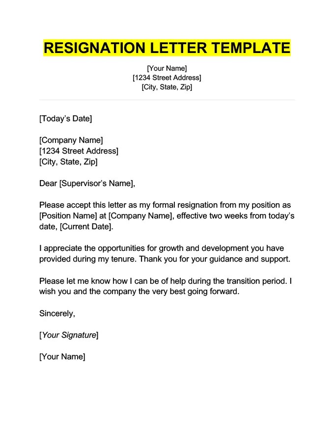
Your resignation letter is the final official communication you’ll have with your soon-to-be-former employer. It’s a lasting impression, a digital handshake on your way out the door. And like any first impression (or, in this case, last impression), presentation matters. The typeface you choose speaks volumes, even before your carefully crafted words are read.
Think about it. A resignation letter in Comic Sans screams something very different than one in Times New Roman. One whispers professionalism, the other shouts immaturity. The right font choice conveys respect, seriousness, and a polished professionalism that will leave a positive final mark, regardless of the circumstances of your departure.
Choosing a resignation letter font isn't about being fussy; it’s about communicating effectively and maintaining a professional image. It's about showing that even in your departure, you maintain a level of attention to detail and decorum. This seemingly small detail can have a surprisingly significant impact on how your departure is perceived.
This isn't just about aesthetics. The right font can improve readability, ensuring your message is clear and easily digested. A poorly chosen font, on the other hand, can distract and detract from your message, potentially causing misinterpretations or, worse, making you look unprofessional. So, what’s the right typeface for a resignation letter?
While there isn't a strict historical precedent for resignation letter fonts, the evolution of business communication norms has dictated certain expectations. Traditionally, professional correspondence, including resignation letters, relied on classic serif fonts like Times New Roman. These fonts were associated with formality, authority, and tradition. As digital communication evolved, fonts like Calibri and Arial gained popularity for their clean lines and readability on screens.
The importance of the right typeface lies in its impact on readability and perceived professionalism. A clear, easily readable font ensures your message is understood efficiently and effectively. The font choice contributes to the overall tone and professionalism of the document, leaving a lasting impression on the recipient.
A suitable resignation letter typeface should be professional, readable, and appropriate for business correspondence. Avoid overly decorative or informal fonts. Examples include: Calibri, Arial, Times New Roman, Georgia, and Verdana.
Benefits of choosing the right font: Increased readability, enhanced professionalism, and a positive final impression.
Action plan for choosing a font: Consider your industry, your relationship with your employer, and the overall tone of your letter. Select a font that aligns with these factors and conveys professionalism and respect.
Checklist: Is the font professional? Is it easy to read? Does it align with industry standards? Does it convey the intended tone?
Advantages and Disadvantages of Different Fonts
While there aren’t inherent disadvantages to using standard fonts, some may be perceived as slightly less modern.
Best Practices: Use a standard font size (11-12pt). Maintain consistent formatting. Avoid decorative fonts. Use black font color. Ensure the font is easily readable.
Challenges and Solutions: If unsure, choose a classic font like Times New Roman. If using a less common font, ensure it's installed on the recipient's device or provide a PDF version.
FAQs: What is the best font for a resignation letter? (Times New Roman, Calibri, Arial) Should I use a different font for my signature? (No, keep it consistent) Can I use a colored font? (No, stick to black) ...
Tips and Tricks: Preview your letter in different fonts before sending. Consider using a slightly larger font size for headings (if applicable). Ensure proper spacing and alignment.
In conclusion, the font you choose for your resignation letter, while seemingly a small detail, plays a significant role in how your departure is perceived. Selecting a professional and readable typeface demonstrates respect, attention to detail, and reinforces your professional image. By following the guidelines outlined above and considering the importance of this often-overlooked element, you can ensure your final communication with your employer leaves a positive and lasting impression. Take the time to choose wisely – it's a small effort that can make a big difference in your professional journey. Your future self will thank you for it. This careful consideration showcases your professionalism even in your departure, leaving a positive final mark on your professional record. This attention to detail, while seemingly minor, speaks volumes about your character and work ethic, contributing to a smooth and respectful transition out of your current role.
Decoding the ram trucks towing capacity your guide to hauling power
The allure of lee min hos future family exploring the curiosity
Unveiling the magic exploring harry potter fanfiction harry heir hogwarts


:max_bytes(150000):strip_icc()/ResignationLetter_2063073_2022-8e52542baa96457bb64d3191e73f9034.jpg)


:max_bytes(150000):strip_icc()/The_Balance_Resignation_Letter_2022-a0d9308168624fc68eba06ff064fa641.jpg)