Unlock Data Insights: Mastering Multiple Pivot Charts from a Single Pivot Table
Ever feel overwhelmed by mountains of data? Struggling to see the real story hidden within those endless rows and columns? Imagine transforming that data chaos into clear, compelling visuals, revealing insights that drive smart decisions. That’s the power of leveraging multiple pivot charts from a single pivot table.
Pivot tables are a data analysis powerhouse, allowing you to summarize and reorganize complex datasets. But the real magic happens when you pair them with pivot charts. Visualizing different aspects of your data with multiple charts linked to the same pivot table opens a world of possibilities. You can see trends, compare performance, and identify key patterns, all from a single, unified data source. This approach empowers you to tell a complete data story, making complex information digestible and actionable.
The origin of pivot tables and charts can be traced back to the early 1990s with the introduction of software like Lotus Improv and later Microsoft Excel. Before these tools, data analysis was a cumbersome and time-consuming process. The ability to dynamically interact with data and create different visualizations from a single source revolutionized the field. Today, these tools are essential for business intelligence, market research, financial analysis, and countless other applications.
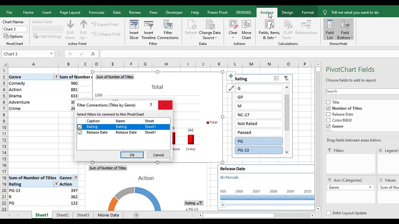
The core importance of using several pivot charts from one pivot table lies in its efficiency and consistency. By linking multiple charts to the same pivot table, any changes you make to the table's filters or layout are instantly reflected in all connected charts. This ensures data integrity and saves you from manually updating each chart individually, reducing errors and boosting productivity. However, a common issue is overcrowding the dashboard with too many charts, which can be confusing. The key is to select the most relevant visualizations that clearly communicate your key findings.
Let’s illustrate with a simple example. Imagine you have sales data for different product categories across various regions. You can create a pivot table summarizing sales by region and product. Then, you could generate a bar chart showing total sales by region, a pie chart illustrating the product sales distribution, and a line chart tracking sales trends over time – all from the same pivot table. This gives you a comprehensive view of your sales performance without having to manipulate the data multiple times.
One of the key benefits of using multiple pivot charts from the same pivot table is the ability to explore different data perspectives. This lets you delve deeper into the data and uncover hidden relationships.
Another advantage is the dynamic updating of the charts. Changes to the pivot table immediately update all linked charts, saving you time and ensuring consistency.
Finally, this technique promotes data storytelling. By presenting different facets of the data visually, you can create a compelling narrative that's easy to understand and drives action.
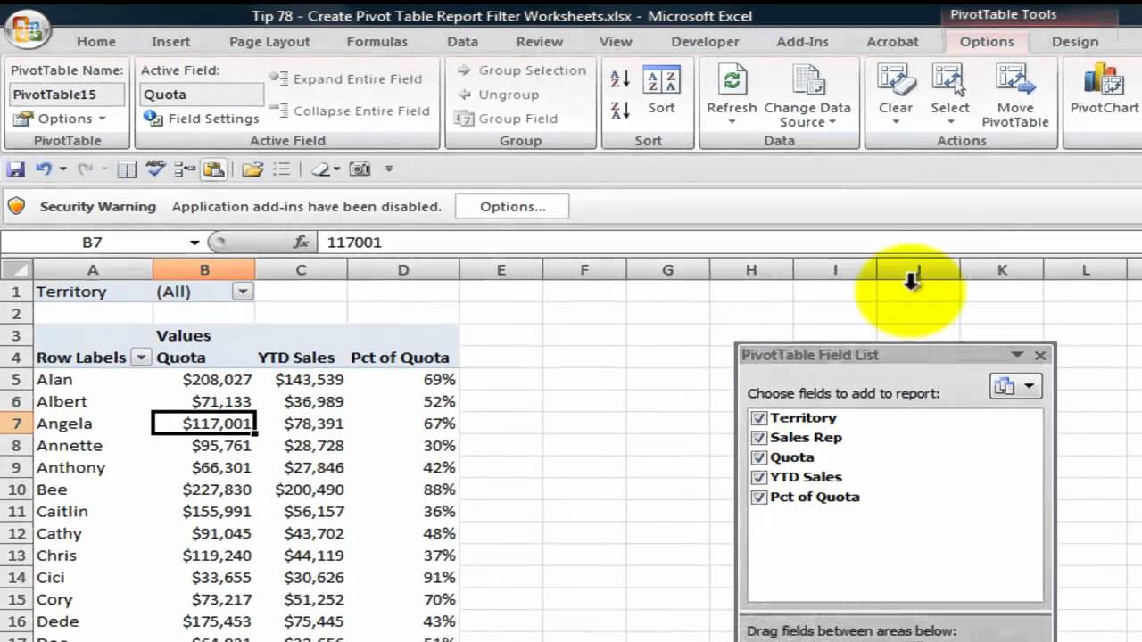
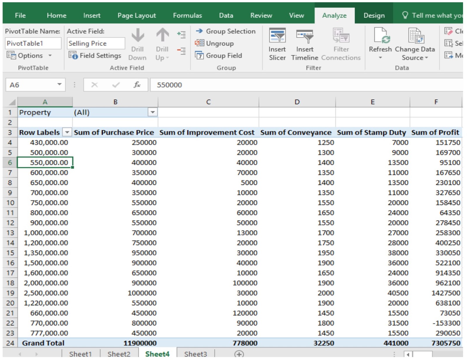
Creating multiple charts from a single pivot table is straightforward in Excel. First, create your pivot table. Then, simply click anywhere within the pivot table and go to the "Insert" tab, choose the chart type you want (bar chart, line chart, pie chart, etc.), and repeat this for each visualization you need.
Advantages and Disadvantages
| Advantages | Disadvantages |
|---|---|
| Data Consistency | Potential for Overcrowding |
| Time Saving | Complexity in managing many charts |
| Dynamic Updating |
Best practices include choosing appropriate chart types, using clear labels and titles, and avoiding visual clutter.
Real-world examples include analyzing website traffic data, tracking sales performance, and monitoring project progress.
A common challenge is ensuring data accuracy. The solution is to regularly verify your data source and pivot table calculations.
FAQ: How do I link a pivot chart to a pivot table? What chart types are best for specific data? How do I filter data in multiple linked charts? How do I format pivot charts? How do I share pivot charts with others? What are the limitations of pivot charts? How do I troubleshoot common pivot chart errors? How can I use multiple pivot charts to tell a story with data?
Tips: Experiment with different chart types, use conditional formatting to highlight key data points, and consider using slicers for interactive filtering.
In conclusion, leveraging multiple pivot charts from a single pivot table is a powerful technique for unlocking valuable insights from your data. It empowers you to explore different perspectives, maintain data consistency, and communicate complex information effectively. By following best practices and understanding the potential challenges, you can transform raw data into compelling visuals that drive informed decision-making. Start harnessing the power of pivot charts today and uncover the hidden stories within your data. Explore different chart types, experiment with layouts, and see what insights you can unearth. The ability to analyze data effectively is a crucial skill in today's data-driven world, and mastering pivot charts is a significant step towards that goal.
Unlocking opportunities your guide to jawatan kosong kilang johor
Unlocking design efficiency the power of download detail pintu dwg
Finding the perfect jeans for curvy women over 50

